2026 TLC Rebrand
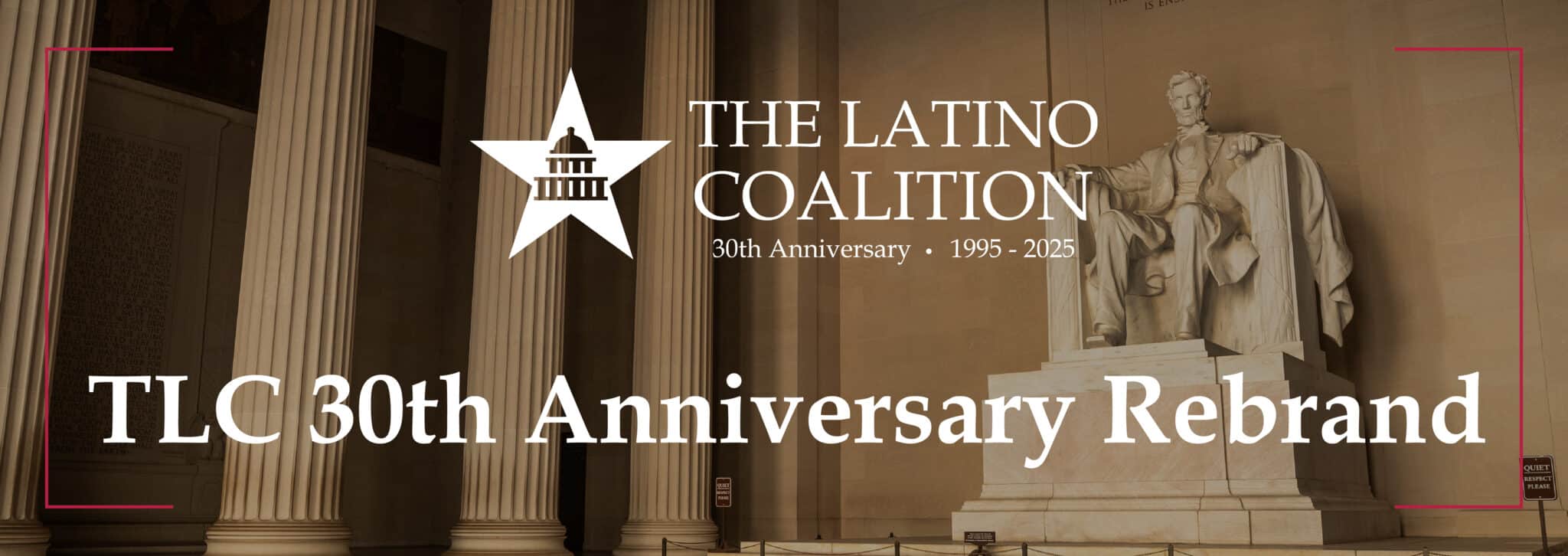
Logo Reveal
The TLC 30th Anniversary logo was created to celebrate a milestone three decades in the making. It reflects our evolution as an organization while honoring the mission that has guided us since day one: building pathways for Latino leaders, businesses, and communities to thrive—today and for the next 30 years.
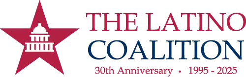
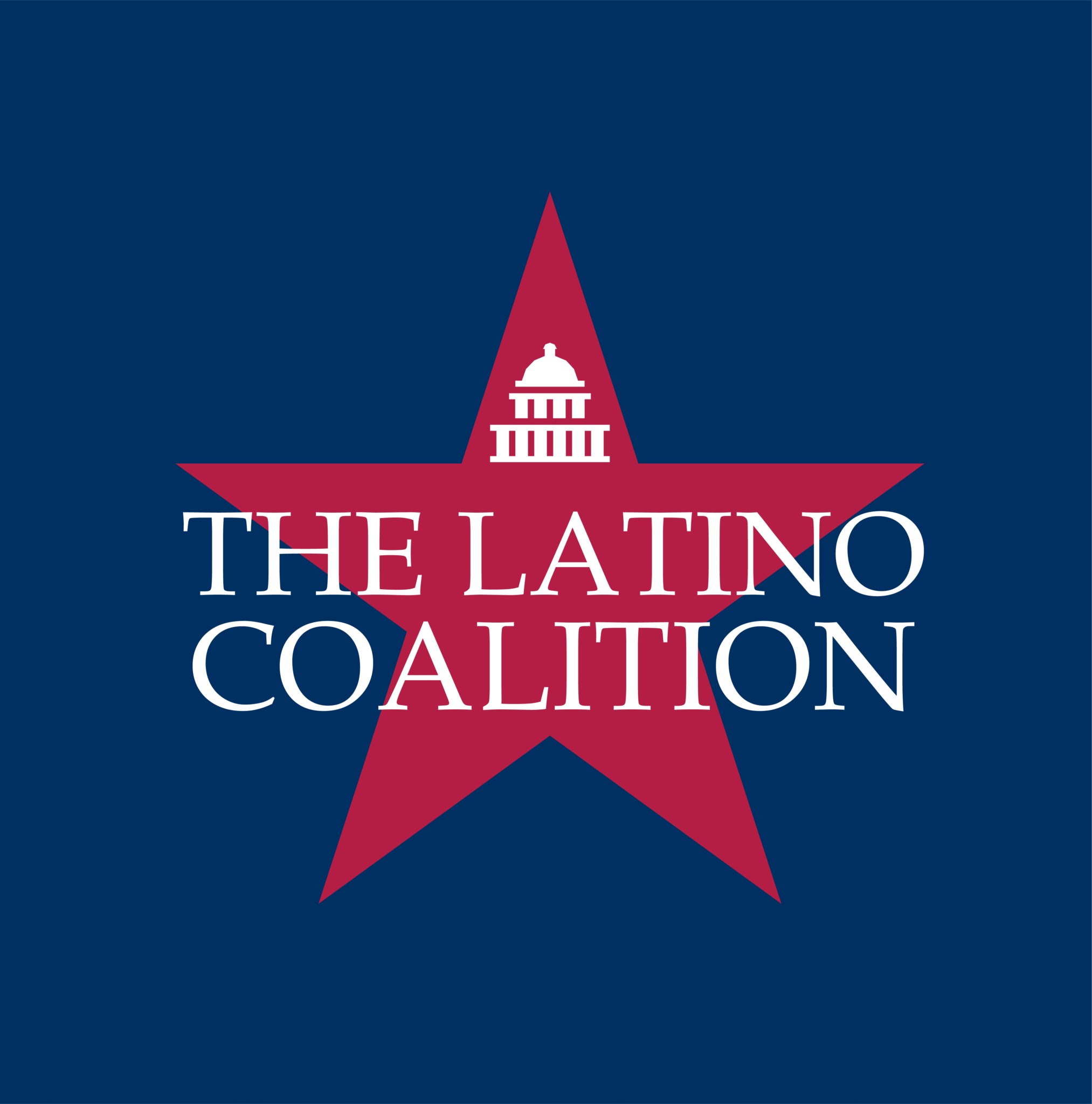
New Logos
The logo features a five-point star with the silhouette of a capitol building centered within it, symbolizing unity, leadership, and purpose. The star represents aspiration, excellence, and the guiding values that shape the organization, while the capitol silhouette conveys strength, governance, and civic pride. Together, they create a powerful emblem that reflects a commitment to progress and collaboration, blending the ideals of community and leadership into a single, timeless mark that is both distinctive and versatile across all brand applications.
New Stationary
The objective of the stationery is to establish a cohesive and professional visual identity across all printed and digital communications. Branded stationery—such as letterheads, envelopes, business cards, and notepads—serves as a tangible representation of the organization’s image and values. Consistent use of design elements like logos, typography, and color ensures that every piece of correspondence reinforces brand recognition and communicates credibility and attention to detail. Additionally, the stationery acts as an extension of the brand’s personality, helping to build trust and familiarity with clients, partners, and stakeholders. Whether used for formal letters, internal documents, or external presentations, the stationery maintains a unified appearance that strengthens the overall brand experience. It ensures that every communication, no matter how routine, aligns with the organization’s identity and contributes to a lasting and professional impression.
")

")